Every owner wants more enquiries until they get them.
Then half the inbox is people asking for a free quote on a $200 job that takes you two hours to scope, two hours to write, and three weeks of follow-up before they ghost. Or it’s the property manager who wants a 30% discount on the first conversation. Or it’s the wedding photographer who wants a roofing quote because Google said you were close.
The marketing person tells you to boost the form. Or rewrite the headline. Or add a free download. The volume goes up. So does the noise.
Nobody is fixing the actual problem.
The actual problem is the form has no door.
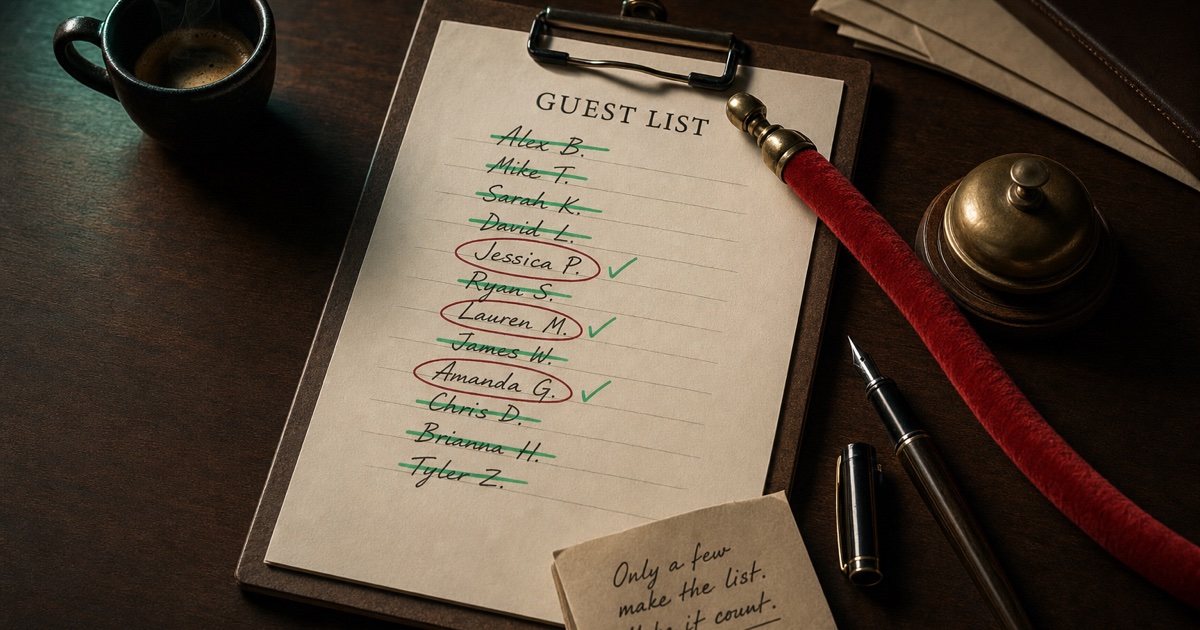
The bouncer is the friendly one at the door
This is where most owners get it wrong.
They imagine a gatekeeper. A wall of qualifying questions designed to make bad-fit leads feel small. The energy is "prove you deserve to email us". The result is real customers also bouncing off because the form felt cold.
That is not the bouncer.
The bouncer at the good bar is the one who smiles, asks two friendly questions, and gently redirects the people who are clearly headed somewhere else. ("Mate, that’s a kids’ thing tonight. The party you want is two doors down.") Nobody feels insulted. Nobody’s night gets ruined.
Your form needs that energy.
Friction with kindness. The wrong-fit lead doesn’t feel shut out. They feel redirected.
What this tool does
Day 24 of the 30-Day Build Challenge: The Contact Form Bouncer.
You tell it two things in plain English:
- What your business does. Who the good customers are, what jobs you actually want more of, the price band you operate in. Plain language, no need to polish it.
- What kind of wrong-fit leads keep wasting your time. Tyre-kickers? Price shoppers? Tiny jobs that aren’t worth the quoting time? Property managers fishing for cheap quotes? The more specific you are, the sharper the third question gets.
You click the button.
The tool hands back three things:
1. The three questions. Each one short, conversational, four multi-choice answers. The answers are scored 0-3 where 3 = perfect fit, 0 = clearest mismatch. You see them rendered as a preview, colour-coded by score, so you can read it like a customer would.
2. The redirect microcopy. For the low-fit answers (score 0 or 1), the tool writes a short friendly line pointing the bad-fit lead at something useful instead. "Sounds like you need a quick patch fix. Try a local handyman, the call-out fee is usually $80-150." No insults. No "we can’t help you". Just a redirect.
3. The HTML. A clean copy-paste block you drop into Webflow, WordPress, Squarespace, Carrd, or plain HTML. No frameworks, no CSS classes, no JavaScript dependencies. Wire the submit handler to reveal your real contact form when the score totals 5 or above, or to show the redirect microcopy otherwise. Done.
How the scoring actually works
Three questions, four options each, scores 0-3. Maximum total = 9. Minimum = 0.
The honest threshold is 5 or above. That’s "at least one perfect-fit answer plus reasonable answers elsewhere", or "three solid-but-not-great answers". Either way, they’re worth your quoting time.
Below 5 and at least one bad-fit answer triggered, the lead sees the redirect microcopy for the answer that flagged. They don’t feel rejected. They feel pointed somewhere actually useful for what they asked about.
Some owners want to be stricter (raise the threshold to 7). Some want to be more permissive (drop it to 4). The HTML is plain, your form-handler is your form-handler, change the number to whatever you want.
What this isn’t
It’s not a sales funnel. There’s no upsell, no email capture before the real form, no "we’ll send you a guide first" nonsense. The bouncer is a single decision: good fit or not.
It’s not magic. The questions are only as good as the bad-lead pattern you described. If you say "I get a lot of bad leads" without saying what makes them bad, the tool will give you generic questions. Be specific about what’s wasting your time.
It’s not a contact form. You still need a contact form behind the bouncer. The bouncer just decides who sees it.
It’s not customer service. The redirects are honest one-liners, not "we’ll get back to you within 24 hours" boilerplate. If you want a fancy fallback page, build one and link to it from the redirect copy.
More leads is not the answer. Better-fit leads is the answer. The bouncer is the cheapest way to get from one to the other.
Why most contact forms have no door
Because they were built on a Friday afternoon by someone who wasn’t the owner.
The site builder asked "do you want a contact form?" and the owner said yes and that was the end of the conversation. The form has a name field, an email field, a message field, a submit button. It’s the default. Every site has it. Nobody thinks about whether it’s qualifying anyone.
Then the owner gets back-to-back wrong-fit enquiries and concludes either "marketing doesn’t work" or "my site is wrong". Usually both. They redesign the site. They spend more on SEO. They get a marketing person. None of it helps because the leak isn’t in any of those places. The leak is the door that doesn’t exist.
Three questions and some honest redirect copy is what fixes it.
Try it: The Contact Form Bouncer
Then pass it to a mate whose inbox is full of jobs they’d never have quoted in the first place if anyone had asked them upfront.