Your customer just hit submit.
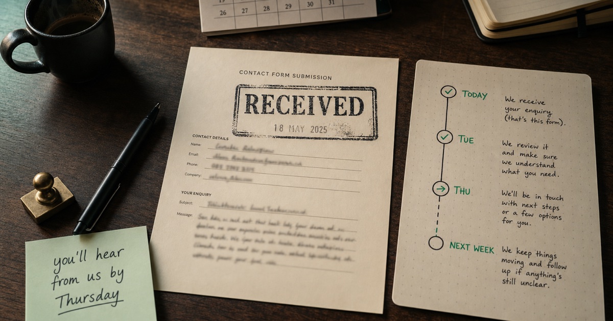
They typed their problem into your form. They paused on the "Send" button longer than they should have. They clicked it. And now they’re sitting on whatever your thank-you page is.
Which, in most cases, is:
“Thanks! We’ll be in touch.”
Or worse, the form just clears and there’s no page at all. They’re left looking at the same blank form, wondering if it went through.
This is the warmest moment in the entire sale. The customer is leaning forward. Their nervous system is in "I’ve committed to something" mode. And you’ve handed them a smiley face.
Why most thank-you pages are dead
Because the form was built on a Friday afternoon by someone who wasn’t the owner. They wired the submit button to a default redirect, the default redirect goes to a page called "thank-you.html", and the page says "Thank you! We’ll be in touch shortly." End of conversation.
No one ever revisits it. The owner doesn’t see it (they’re on the receiving end, not the sending end). The web person isn’t a customer. The agency that built it moved on three projects ago.
Meanwhile, every customer who fills out the form lands there. Every single one. And the page does nothing for them.
The customer just took an action. They’re leaning forward. What they need is reassurance, expectations, and a few specific instructions.
What an honest thank-you page looks like
Eight sections. None of them sales. All of them useful.
- Thanks, we got it. Confirm the form worked. Confirm they don’t need to re-submit. Warm, short, done.
- What happens next. The actual sequence on your end. Two or three specific steps. "We read every enquiry. The right person picks it up. You hear back by email."
- How long it usually takes. A real time window, in plain language. "Most replies go out within 24 hours on weekdays. If you sent this on a Friday afternoon, Monday morning is realistic." No "we’ll get back to you ASAP" nonsense.
- What we may ask you. Three to five things you commonly need to give a useful reply. Photos. Address. Council consent number. Their timeline. Specific to your service.
- What you can prepare. What the customer can do right now to speed things up. "Take a quick phone video of the leak. Find your most recent power bill." Concrete.
- What not to stress about. Honest reassurance. "You don’t need to call. You don’t need to re-submit if you didn’t get an instant email. We’ll ask if we need photos."
- Emergency or urgent path. If it’s genuinely urgent, what to do. "If a tree is on the house, call this number instead." Honest. Not hedged.
- Closing line. A human reassurance line, OR a soft pointer to something actually useful on your site. NOT a newsletter signup. NOT "check out our blog!". The customer is mid-transaction; respect that.
That’s the page. Most of it is twelve to thirty words per section. The whole thing reads in under a minute.
What it does to your business
Two things, mostly.
First, it can reduce follow-up. A clear receipt tells customers their enquiry arrived. That can save an email, a phone call or a duplicate submission asking whether you got it.
Second, it can help customers prepare. When the page says "we may ask you for photos and your address," customers know what to have ready. That can shorten the back-and-forth.
These are potential benefits. This article does not report a measured reduction in follow-up or a customer study.
Tell customers their message arrived, what happens next and what to have ready.
What the tool does
Day 25 of the 30-Day Build Challenge: What Happens Next.
Two inputs:
- What your business does, in plain English.
- What the form is. A booking enquiry? A quote request? An event hire form? A general contact form?
Two outputs:
- A live preview of the page so you see how it reads.
- Two copy-paste blocks: clean markdown, and semantic HTML with no CSS classes. Drop either into Webflow, WordPress, Squarespace, Notion, Ghost, plain HTML, anywhere.
The tool generates the eight sections specifically for your business. The "what we may ask you" section knows what a physio enquiry needs vs a roofing enquiry vs a wedding venue. The urgent path adjusts to whether the service is urgency-prone or not.
What this isn’t
It’s not a sales funnel. There’s no upsell on the generated page, no newsletter capture, no "while you wait" content tease. The customer is in the middle of a transaction; respect that.
It’s not a form builder. You still need a contact form. The thank-you page is what sits after the submit button.
It’s not a transactional email. This is the on-site page. You should also send the customer an email confirming the same things, but that’s a separate piece.
It’s not a one-size-fits-all template. The output is shaped by the business and the form type you describe. Run it twice for two different forms (booking vs event hire) and you’ll get two different pages.
Try it: What Happens Next
Then go look at your current thank-you page. If it says "Thanks! We’ll be in touch shortly" and nothing else, you have an easy fix in front of you.