You know what most clinic websites do?
They smile politely.
They tell you they are caring. They tell you they are professional. They tell you they use a personalised approach, because apparently every allied health website was legally required to say that in 2014 and nobody has challenged it since.
Then they hide the real questions.
The questions people actually have before they book.
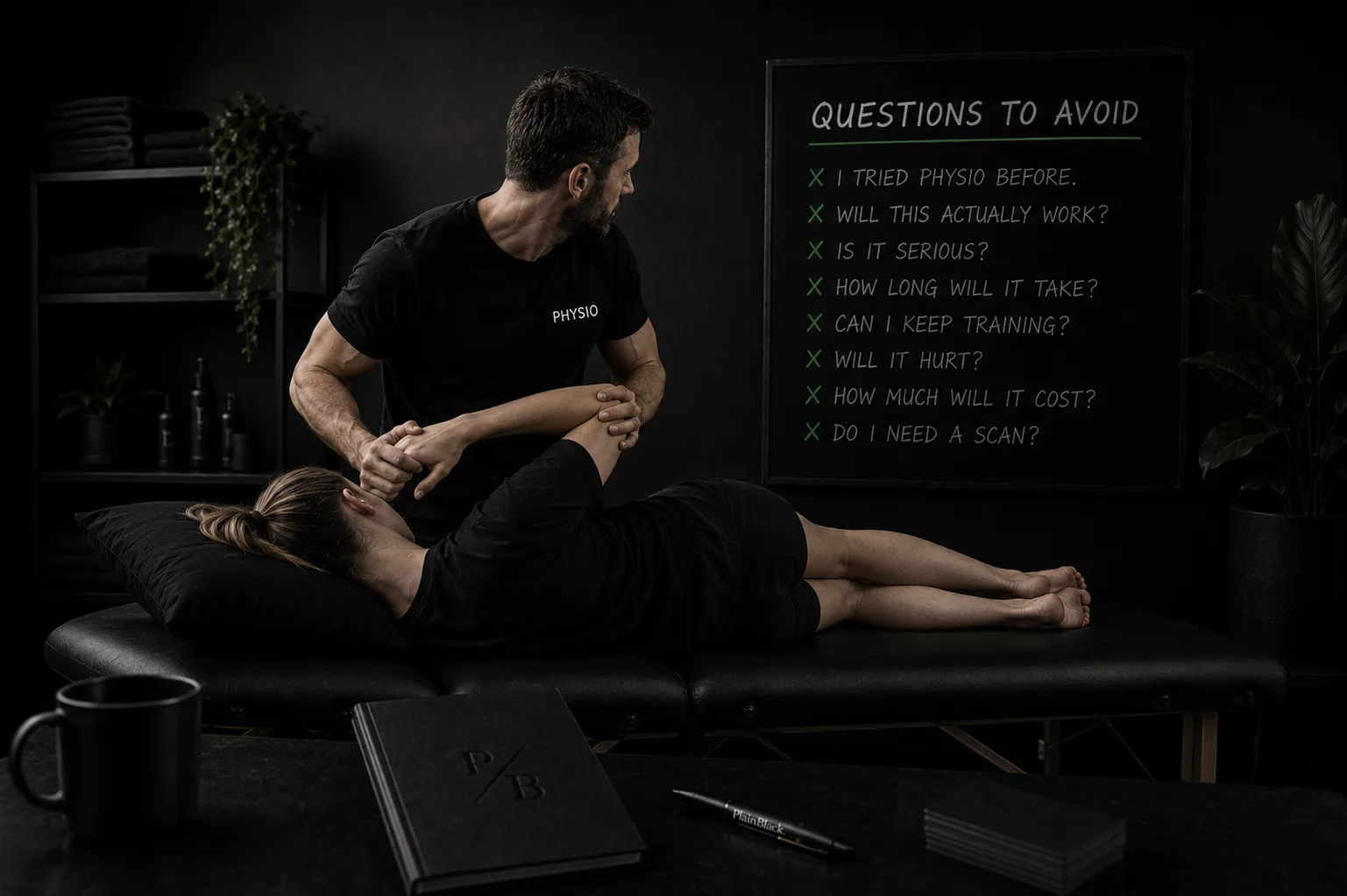
"Will this work if physio didn't work last time?"
"Is this going to cost me a fortune?"
"Can I keep training?"
"Do you actually need to see me if I already have a scan?"
"Is this bad enough to stop ignoring?"
Those are the questions that decide whether someone books.
So today's build was simple.
We made the awkward bit the welcome mat.
What I built
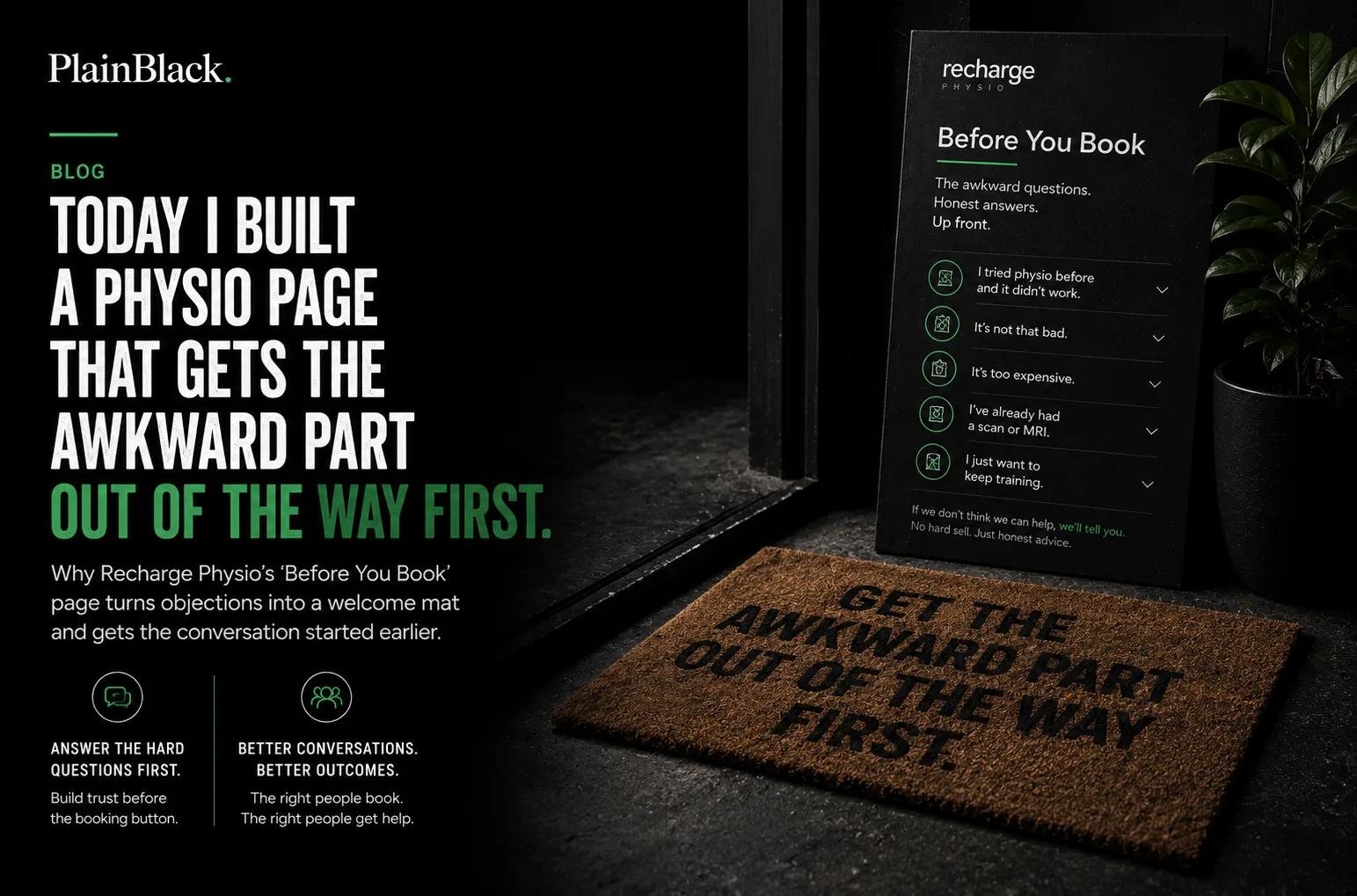
I built a Before You Book page for Recharge Physio in Papamoa.
It is basically an Objection Wall.
Not a FAQ. Not a brochure. Not a "your wellness journey starts here" situation with a stock photo of someone stretching near a fern.
A wall.
Five real objections. Five honest answers. Up front.
The page opens with Jaydn Nixon, owner of Recharge Physio, saying the quiet part clearly: most clinics bury awkward questions inside a marketing FAQ, so Recharge put them up front and answered them like grown-ups. The page then walks through five common concerns: "I tried physio before and it didn't work," "It's not that bad," "It's too expensive," "I've already had a scan or MRI," and "I just want to keep training."
That is the tool.
Not complicated. Not flashy. Just useful.
Which is usually where the money is hiding.
Why this tool exists
Because trust does not start at the booking button.
Trust starts earlier.
It starts when someone lands on a website and quietly thinks:
"Are these people going to get me?"
"Are they going to waste my time?"
"Are they going to tell me to stop doing the thing I love?"
"Are they going to charge me before I know whether this is even the right move?"
"Are they going to pretend physio works for everything?"
Most websites pretend those questions are not in the room.
The Objection Wall points at them and says:
Yep. We heard that too. Let's talk about it.
That matters because the customer is not always looking for more information. Sometimes they are looking for permission to be honest.
A normal FAQ answers tidy questions.
An Objection Wall answers the ones people are too polite, embarrassed, or tired to ask.
That is the difference.
The problem
Physio is high-trust.
People are not booking a haircut. They are bringing pain, fear, frustration, old injuries, bad experiences, money worries, and the sneaking suspicion they have already left it too long.
And if they have tried physio before and it did nothing, the trust gap gets wider.
That is the specific pain this build is aimed at.
Not "clinic needs better website copy."
Too vague. Too beige. Off it goes into the marketing compost.
The real pain is:
People who need help hesitate because their real concern is not answered clearly enough before they book.
So they wait. Or ask a mate. Or Google symptoms until they accidentally diagnose themselves with seventeen things and a Victorian railway disease. Or they book somewhere cheaper, closer, louder, or more familiar.
Not because Recharge is the wrong clinic. Because the website did not get the awkward part out of the way yet.
The solution
The solution was to turn the objection into the page.
Each section starts with the patient's actual internal sentence.
Not:
"Do you offer evidence-based treatment plans?"
No human has ever said that while limping to the kettle.
Instead:
"I tried physio before and it didn't work."
Recharge's answer does not dodge it. It says sometimes the previous physio missed what was going on, sometimes the diagnosis was right but the treatment was wrong, and sometimes physio was never going to fix it in the first place. Then it gives the next move: tell us what happened last time, and we'll say whether we think we can help.
That is trust-building.
Not because it sounds polished.
Because it sounds like someone who has actually had the conversation before.
The same pattern shows up in the "wait and see" section. The answer does not panic people into booking. It says sometimes waiting is the right call, then names the signs that change the decision: night pain, worsening pain after a fortnight, pins-and-needles, or avoiding normal activity.
That is the move.
Not "book now before it gets worse."
More like:
Here is when you can wait. Here is when you probably shouldn't. Now you can make a better call.
Why this adds value
This page does four useful things before the first appointment.
First, it makes the clinic sound human. Not "brand human." Actual human. The kind with a phone, a spine, and the ability to say "if we can't help, we'll point you at who can." Recharge uses that exact promise at the bottom of the page.
Second, it qualifies the conversation. Someone who reads the page before calling is already warmer. They understand how the clinic thinks. They know what will happen. They know what to ask. That means the front desk gets fewer vague calls and more useful ones.
Third, it reduces fear. The page answers money concerns, scan confusion, previous failed treatment, training worries, and the classic "it's probably fine" delay. Those are not random content blocks. They are friction points.
Fourth, it gives the website a reason to exist beyond "here is our phone number and a photo of a treatment room." A website should do a job. This one builds trust before the booking. Radical stuff. Next we may discover chairs.
Who would use this
This tool is for any business where the customer is carrying an unspoken worry before they enquire.
- Physios
- Osteos
- Dentists
- Allied health clinics
- Funeral celebrants
- Lawyers
- Accountants
- Tattoo artists
- Builders
- Wedding photographers
- Anyone who sells a service where trust matters more than a quick price check
The shape changes by industry, but the logic stays the same.
A dentist might answer: "Will you judge me if I haven't been in years?"
A lawyer might answer: "Am I going to get charged every time I ask a small question?"
A builder might answer: "What happens if the quote changes halfway through?"
A photographer might answer: "What if we feel awkward in front of the camera?"
These are not FAQs. They are the questions underneath the enquiry. That is why they matter.
Problem vs solution
Problem: The website answers the safe questions. Opening hours. Services. Fees. Location. Team bios. The required furniture.
Solution: Add a page that answers the uncomfortable questions customers are already asking silently.
Problem: The business keeps getting vague enquiries. "Just wondering about pricing." "Do you do backs?" "How much for an appointment?" "Can I book?"
Solution: Give people context before they contact you, so the enquiry starts halfway through the real conversation instead of at the lobby.
Problem: The business says "we care," but the page sounds like every other clinic.
Solution: Prove care by answering the thing the patient is nervous to say out loud.
Problem: The customer has had a bad past experience and assumes this one might be the same.
Solution: Name that experience directly. Explain what you do differently. Do not pretend the concern is irrational.
This is where most marketing gets it backwards. It tries to make the business look less risky.
Better move:
Talk about the risk honestly. That is how people know you are not hiding from it.
The wall is the welcome mat
The more I look at this build, the more I think "Objection Wall" is slightly wrong.
It is not a wall to keep people out. It is a welcome mat.
A proper one. Not the decorative kind outside a display home that says "blessed" while hiding six unpaid invoices and a dog with opinions.
A useful welcome mat. It says:
Before you step in, here are the things you might be worried about. We know. We have heard them before. You can ask them here.
That is a much better first impression than pretending everyone arrives calm, informed, financially relaxed, and ready to commit.
They don't.
People arrive with baggage.
The website can either ignore the baggage, or help carry it to the door.
"Trust starts before the booking button. The Objection Wall is where that starts."
Where this plugs into the bigger PlainBlack system
This build also connects neatly with two other PlainBlack tools.
The first is The Customer Translator. That tool takes vague customer enquiries and translates what they actually mean, what they are worried about, and what to say back. Day 13's build was based on the idea that most agencies obsess over the messages businesses send, but very few help them understand the messages they receive.
The Objection Wall is what happens when you spot the same worries showing up again and again. You stop answering them one by one in the inbox. You build the answer into the website.
The second plug-in is a Review Language Miner. Because reviews are where customers tell you what they actually trusted after the fact.
For Recharge Physio, that means pulling useful patterns out of public reviews and customer language:
- What words do people use when they feel listened to?
- What did they worry about before booking?
- What changed after treatment?
- What proof actually matters?
Then those phrases can feed the Objection Wall, service pages, homepage copy, and testimonial sections. Not fake polish. Customer language, made useful.
That is the system:
Customer messages show you the hesitation. Reviews show you the proof. The website connects the two.
The commercial bit
This is exactly the kind of page every high-trust business should have.
Not because every site needs another page. Because every useful website needs a trust mechanism.
A homepage says who you are. A service page says what you do. A fees page says what it costs.
An Objection Wall says:
"We know what you're actually worried about, and we are not afraid to answer it."
That is valuable.
For the business, it can mean better enquiries, fewer repetitive phone calls, stronger trust, and more people booking with confidence. For the customer, it means less confusion before they make a decision.
That is the sweet spot.
Less friction for the owner. More clarity for the customer. No marketing theatre required.
Day 16 of 30. Fourteen days to go.
Most clinic websites answer the questions the business feels comfortable publishing. This one answers the questions the patient is actually carrying.
That is why it works.
The awkward part was never the problem. The awkward part was the doorway.
Open the page full-screen on Recharge Physio's site. Recharge Physio in Papamoa is a real clinic; the site is a spec-demo so clinics can see what their own version would look like.