I have ordered Pad Thai too many times.
When I sit down at a Thai restaurant, or Indian, or anywhere the dishes have unfamiliar names, I read down the list, can't picture what most of them taste like, and order the safe one. Pad Thai. Chicken stir-fry. The one I know.
The kitchen never gets to show me what they actually do best. The cool dishes, the chef's pride, the slow-cooked-meat ones, the ones with the unusual paste, sit on the menu, occasionally ordered. If you run a restaurant where customers default to the safe order, you're losing the better ticket every shift, on most tables, without ever knowing it.
Not every menu has this problem. A burger menu doesn't. A pizza menu doesn't. A sandwich shop is fine. The problem is sharpest in cuisines where the dish names are unfamiliar to the average customer, especially when they're written without a photo or a help me decide nudge to lean on. Thai. Indian. Chinese. Fancier mid-tier where the menu is in chef-speak.
Today I built the fix. It's a QR-code ordering tool for Thai Thani Papamoa, my local Thai restaurant five minutes down the road.
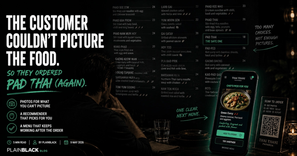
Most QR menus are a PDF on a phone.
You scan the code on the table. A page loads. It is the same printed menu, just on your phone. Maybe a search box. No photos. No recommendations. No allergen filter. No way to actually order. You read, you wave at a waiter, you order the safe one anyway.
Switching to a QR menu like that doesn't fix the problem. It moves the problem to a slightly smaller screen.
The version I built for Thai Thani starts from the same data underneath, but behaves differently. Three things change everything.
One. Photos for the dishes that need them.
Not every dish on a menu needs a photo. The customer can already picture a burger. They can picture fish and chips. They don't need a photo of the green salad to decide.
Curries do need photos. Most Thai stir-fries do. Phad See Eew, Phad Kra Prow, Phad Nam Mum Hoy and Phad Thai don't read very different from each other after the third one, but they look completely different on the plate. The dishes that lose orders to text-only menus are the ones the customer cannot picture, and that is where the photo earns its keep.
For Thai Thani's production version, the per-dish photography is a half-day shoot at the restaurant. For the build I shipped today, every dish has a photo. Some are the actual Thai Thani photography pulled from their existing website. The rest are placeholders, flagged as such. The point of the placeholder approach is to prove the layout. The point of the production version is to commission the proper shoot.
Two. A recommender for the customer who can't decide.
This is the toy. Three short questions, twenty seconds, the chef picks a dish.
How hungry are we? Just a snack, a decent meal, or starving. How hot can you handle? Mild, medium, properly spicy, or Thai-hot no mercy. The chili meter at the top fills as you tap. What mood are we in? Comforting, adventurous, or fresh and light.
Then a card slides up with the chef's pick. A real photo of the dish. A one-line recommendation written in the chef's voice. "Coconut cream and a long, slow simmer. You'll see." One button to add it to the order. One button to try another. One button to skip the recommender and browse.
The scoring engine underneath is simple on purpose. Mood matches dish family. Heat preference scores against the dish's baseline. Chef picks and popular items get a small bonus. Allergens are a hard penalty. It is tunable by hand, not a model that needs training data we do not have on day one.
The point of the recommender is not to remove choice. It is to nudge the customer into the part of the menu they would not otherwise visit. Same regular customer, slightly more interesting order, slightly bigger ticket.
Three. The menu doesn't quit when you send the order.
This is the bit nobody else is doing.
Most QR menus exist for a single moment. The customer scans, the customer sends the order, the URL is dead from there. Once the order is in, the QR sticker on the table is just a sticker.
The version I built doesn't quit.
Halfway through the meal, the customer scans the code again. The tool recognises this is a follow-up scan, skips the welcome, and shows five things the printed menu can't:
Order another drink. One tap, drops them straight into the drinks list, fires through to the kitchen.
Call the server. A quiet ping, the server comes over, the customer didn't have to flag a busy waiter from across the room.
Order more food. Back into the full menu. Cart resumes where they left it.
Leave a Google review. Direct link to Thai Thani's actual Google listing, ready to write. Reviews from happy guests at the table, while the meal is still good, beat reviews chased over email a week later.
#ForTheGram. Camera capture. The restaurant's handle and a curated hashtag list pre-loaded. One tap to Instagram or Facebook. Customer was going to share the photo anyway; now it is tagged correctly.
None of the five are gimmicks. Each one earns its keep. The Google review one is the quiet hero, because the average ticket is not the only metric a restaurant tool can move.
Smart upsell, allergen-aware, table or counter, all from one scan.
Three smaller things that matter.
After a main is added to the order, a small carousel of compatible sides and drinks pops up. Hunger-aware: a "starving" customer sees a starter prompt, a "snack" customer just gets offered a drink. Won't re-suggest things already in the cart. Even a 30 percent accept rate on sides moves the average ticket meaningfully.
Allergens at the start. Tap the seven big icons (peanut, shellfish, fish, gluten, dairy, egg, soy) and the menu remembers. Dishes that contain those ingredients are visibly flagged or dimmed throughout. The kitchen sees the allergens on the order. If the customer is anaphylactic about peanuts, the kitchen knows before the wok hits the heat.
One scan, two contexts. From a dine-in table, the end screen reads "sent to the kitchen, table 7. Your server has been notified." From the takeaway counter, the end screen reads "show this code at the counter" with a big cursive order code. Different physical contexts, same engine, no toggle for the customer to find.
Why this works for any "wall of unfamiliar choice" business.
The shape isn't restaurant-specific.
It works for any business where the customer hits a list of options they cannot pre-evaluate, and where confidence drives the decision. Indian restaurants. Chinese. Thai. Wine bars with thirty bottles by the glass. Coffee shops with twenty bean origins. Garden centres with three hundred varieties of camellia. Hardware stores with eighteen kinds of decking screw. Pharmacy aisles. Asian grocers. Any specialty retailer where the customer is making a confidence-driven choice and the staff are not always free to walk them through it.
Three days into the same pattern: Bradley Roofing got a quote-fit filter, Genr8 Energy got a solar trace toy, Thai Thani got a menu that helps the customer decide. Different industries, different trades. Same engine: take the moment a customer normally bounces off a wall of unfamiliar choice, and replace it with a small, photographable, talkable tool that gets them to "yes" in under a minute.
Day 9 of 30. Twenty-one to go.
Try it yourself. Build an order, leave the cart, come back and see it remembered. Place a fake order to see the post-meal loop kick in.